 The pianist Glenn Gould famously declared that the correct ratio of artist to audience is “one-to-zero.” Not so fast, says PureHoney artist of the month Todd Alcott. “I wouldn’t go that far, because the marketplace has its rules,” Illinois-born, Los Angeles-based Alcott says in an interview, “but being true to your own interests is key.”
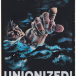
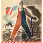
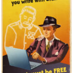
A creator of comic designs that echo mid-century modern periodicals, and a remixer and updater of pulp magazine covers, Alcott has no issue with finding audiences. Besides having a popular Instagram, he’s also a bona-fide Hollywood screenwriter, with credits across 30 years including Antz and The Hudsucker Proxy. But he speaks more fondly about his visual output.
“It was so incredibly difficult to find any artistic satisfaction in being a screenwriter, where I would spend months or years working on screenplays that never got produced,” Alcott says. “It was well-paying work but incredibly hard to get a job and then no guarantee that any of my work would ever see the light of day. With the visual art, I could make it at my desk, post it on the internet, and sell it immediately, which was so much more gratifying.”
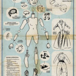
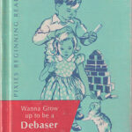
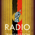
Alcott has landed on a Don Draper-esque aesthetic that he now practically has to himself. “My father was in advertising during the Mad Men era, so mid-century design is very much my childhood. That whole era, from, say, the end of World War II to the election of Ronald Reagan is a time in American history when anything seemed possible, and so much was going on, culturally, in so many different directions. So that era of design has a strong nostalgic pull for me.”
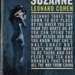
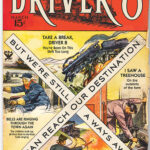
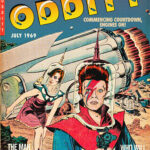
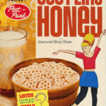
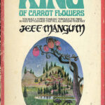
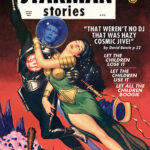
Two more nostalgic elements inform Alcott’s work: vintage typography and pulp fiction. The pulp art, interestingly, begins with songs, primarily classic rock: Alcott picks a track he loves and then visualizes it as a vintage magazine or book cover. So David Bowie’s “Life on Mars” inspires an eerie paperback visual straight out of the classic Avon and Ballantine sci-fi catalogues. For “Rid of Me,” PJ Harvey is a detective-story femme fatale.
“I got attracted to pulp art because of its drama and immediacy,” Alcott says. “The artists doing these magazine and book covers were creating pieces that had to compete with hundreds of other covers on newsstands. There was no television to compete with so their only competition was with each other.”
Those artists “had to keep making their illustrations more dynamic, weirder, more extreme, more sensational, and more lurid,” he adds. “The sensationalist aspect of pulp illustration gave me an entrée to pop music’s emotional side, which is, ultimately, what the pieces provide: an emotional resonance on the part of the viewer that helps them to see the song from a new and different angle.”
Hence, “Help Me” dramatized as a comic book cover with Joni Mitchell and her guitar plunging Vertigo-style off a roller coaster. Garbage’s “Only Happy When It Rains” ventures outside of pulp romance and into packaging design: the ubiquitous Morton Salt girl in the yellow dress, strolling through a squall.
Alcott’s exquisite hand lettering completes the effect. “Almost everything I do is based on an existing piece of design — a magazine cover, book cover, movie poster, advertisement, something,” he says. “And font choice is the key to making a piece specific.” Fonts, he says, represent particular time periods and moods — “and the viewer hopefully gets that without having to know all the history,”
Years ago as a kid in art class, Alcott had an assignment to create a poster. For inspiration, he turned to an ad from 1974. “I remember looking at the font in the advertisement and thinking, ‘Why does this font make me feel a certain way?’ and then being frustrated at how difficult it was to match my lettering to theirs.
“I sat down with a pencil and a ruler to try to figure out how making a letterform thicker or changing a curve slightly changed the whole effect of the font. Those things have always been important to me. Fonts are important because it’s the first thing people see, and if the font feels right, the viewer trusts that you know what you’re talking about.”
Find @toddalcott on Instagram and ToddAlcottGraphics at Etsy ~ Kelli Bodle

